

PROJECT roles
Secondary Research Comparative Research User Research
Visual Design Wireframing Prototyping
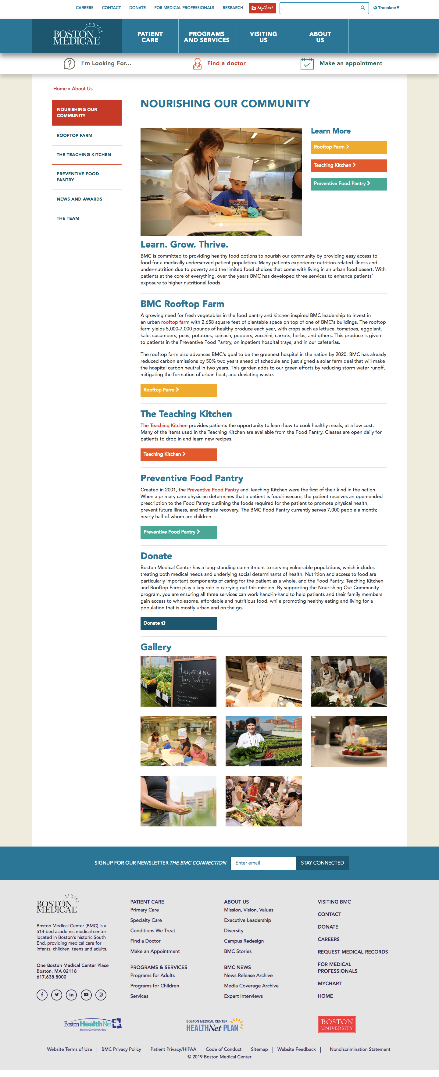
create web pages about San Francisco food resources and the Food as Medicine collaborative for the San Francisco Department of Public Health.

DISCOVERY


the process
01 PROJECT BRIEF
For this project, I collaborated with two other UX designers to work with the San Francisco Department of Public Health to create webpages for food resources in San Francisco for both their SF Health Network website as well as their SF.gov website. A big parameter as far as designing for the pages was to figure out where the pages would live within the current websites and creating content that fits in line with how those existing pages look and feel. The entire project was conceptualized and created in 16 days.
02 COMPARATIVE ANALYSIS
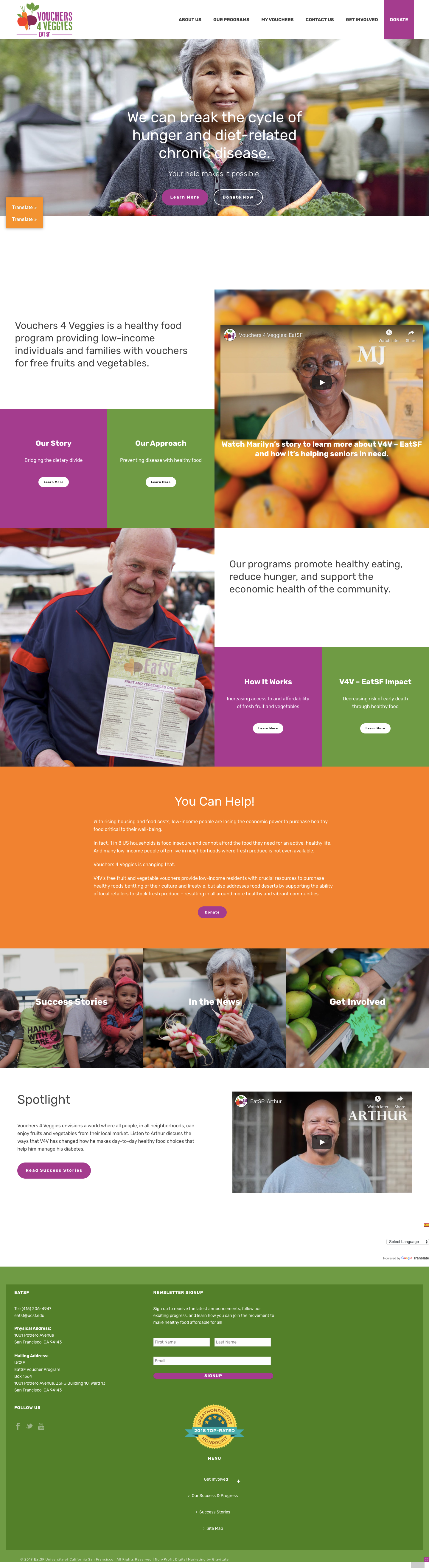
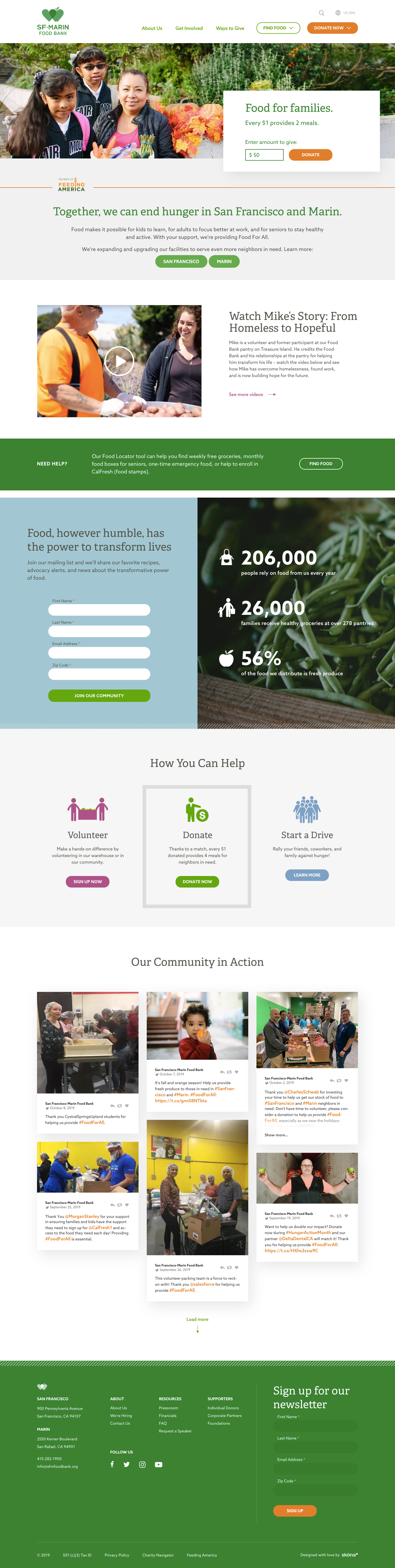
Taking into consideration what type of information and how that information would be displayed was arguably the most important part of the design process for this project. This meant essentially taking a look at what information currently existed on other food services pages and how we could best provide users with the resources they need to find information about food services in San Francisco. By comparing how other states and other Bay Area food resource webpages displayed their information, we were able to gain clarity on how we wanted to accomplish similar goals with our webpages.
03 INFORMATION ARCHITECTURE

With the content that had been created and built up, it was imperative to organize all of the content in a way that would make it easier for users to find exactly what they were looking for. Being able to meet the expectations of the users as far as what they would see on each page and what type of content would go on each page as well as ensuring that the verbiage and word choice being used for categorization of each section made sense were big factors into how this was accomplished.
04 CONTENT STRATEGY

When strategizing how the content should be displayed, we determined that it was important to accomplish three goals with the information being displayed:
1. Simplify the language being used
2. Use imagery that is both easy to follow and is engaging (i.e. strong calls to action)
3. Only display what is deemed “necessary.”
We didn’t want to overwhelm our users with just a list of too many resources or website links that didn’t have any meaning or depth to them. Some of the ways we went about accomplishing these goals were to include bright, colorful iconography, using 6th-grade reading levels for our text, and checking our product with our MVdP (minimum viable desirable product) checklist.
05 WIREFRAMING & PROTOTYPING


The only challenges for creating the wireframes and prototype for this product were to stay in line with the look and feel of other SF Health Network pages and SF.gov pages. For the SF Health Network site, I decided to stick with a key feature, the right hand navigation bar, which really enabled the users to have effortless navigation through our pages. I also had to include the header and footer that is currently being used across that website. For the SF.gov site, the challenge was more or less the same.