
PROJECT roles
Primary Research Competitive Analysis Content Strategy
Visual Design Wireframing Prototyping
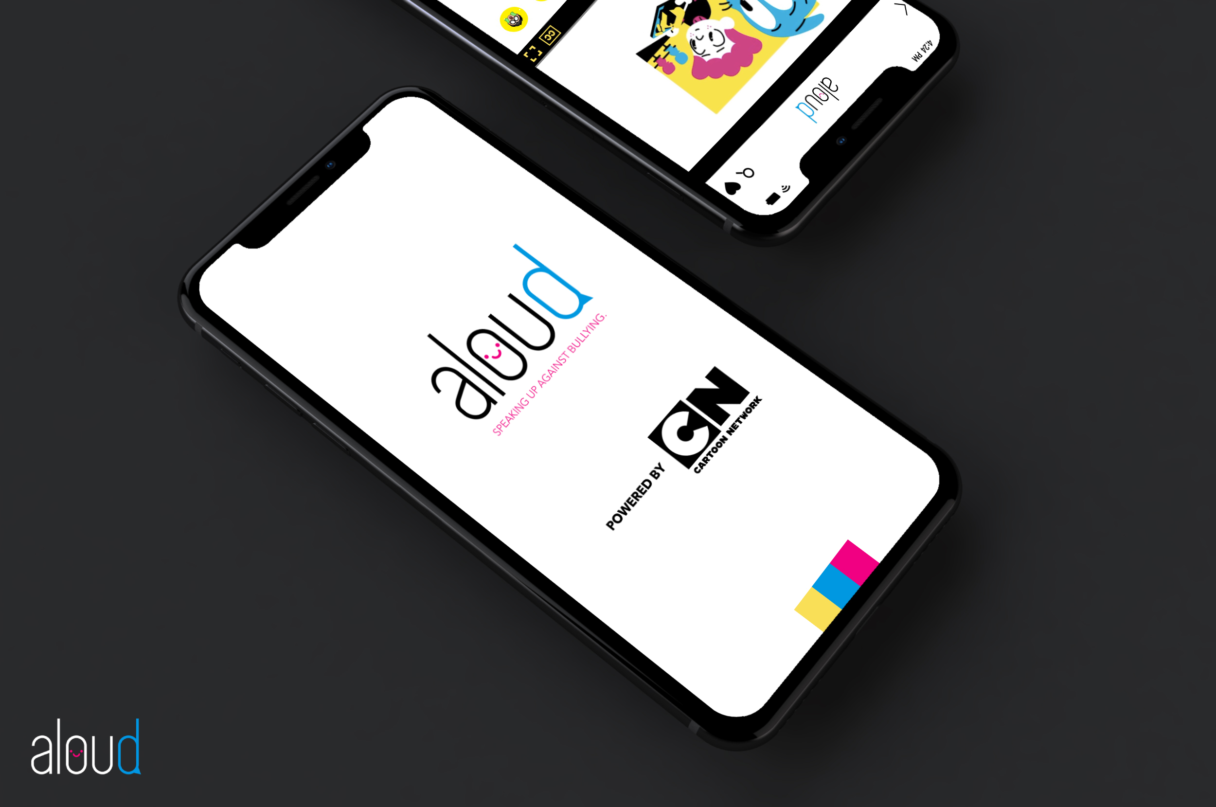
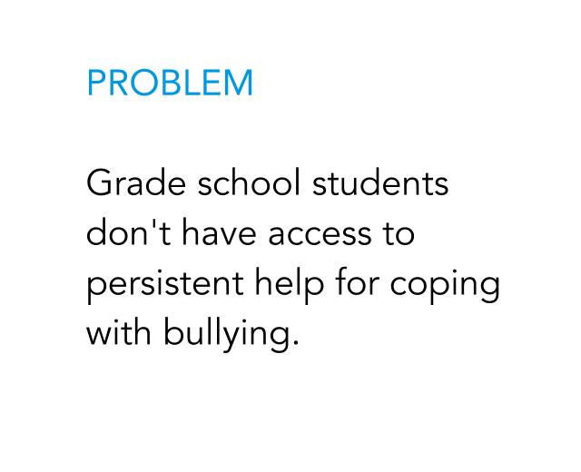
The aloud app is an application designed for kids in a bullying-related situation that provides video content with tips on how to solve the problem they’re facing.

DISCOVERY


THE PROCESS
01 RESEARCH
The entire premise of the research for this product’s development was to gain perspective. Why is it necessary for children to have access to content and solutions? A study done with 9 - 11 year olds by the Harvard Graduate School of Education verified the problem set and gave us confirmation that children that are being bullied do need more explicit solutions pushed towards them before taking any real action.
02 PROJECT BRIEF
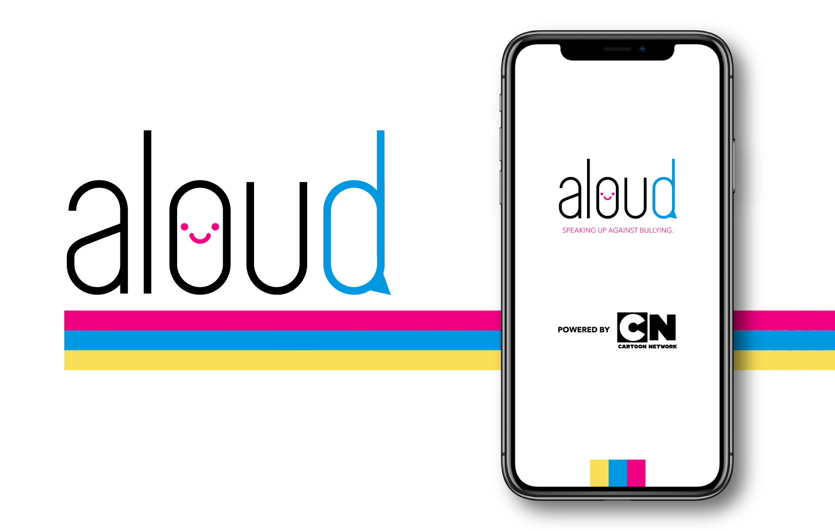
For this project, we were tasked with designating a potential brand to pitch our product and solution to. Pairing with Cartoon Network would be the perfect match for an anti-bullying resource as they already have their own anti-bullying campaign as well as access to countless hours of content driven by anti-bullying or revolving around popular bullying topics and solutions. Designing the product and the product pitch had to be completed within a two-week time frame.
03 BRANDING
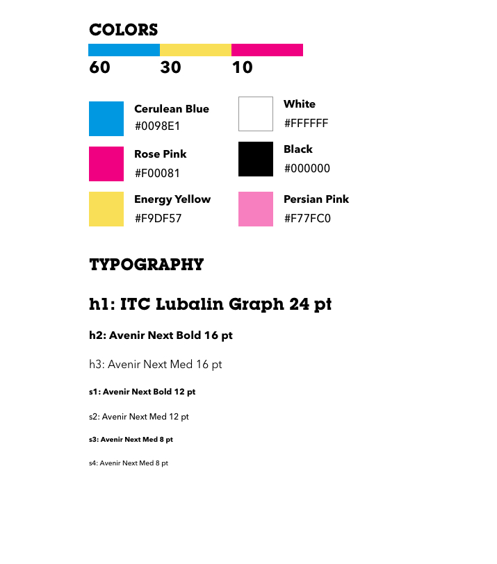
The decision to borrow styling from Cartoon Network stemmed from the desire to give the viewer an authentic and immersive look and feel of a pairing between aloud and Cartoon Network. This made it that much more important to align and maintain the parallels in Cartoon Network’s own branding with the design of the aloud application. Everything from typeface to color usage was carefully considered.
04 wireframing & prototyping
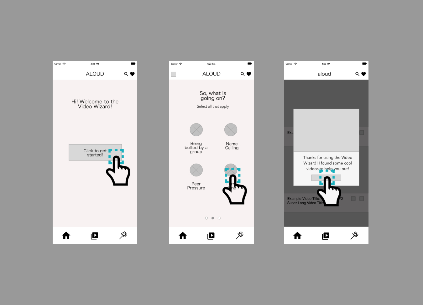
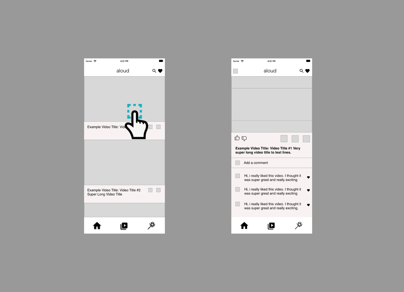
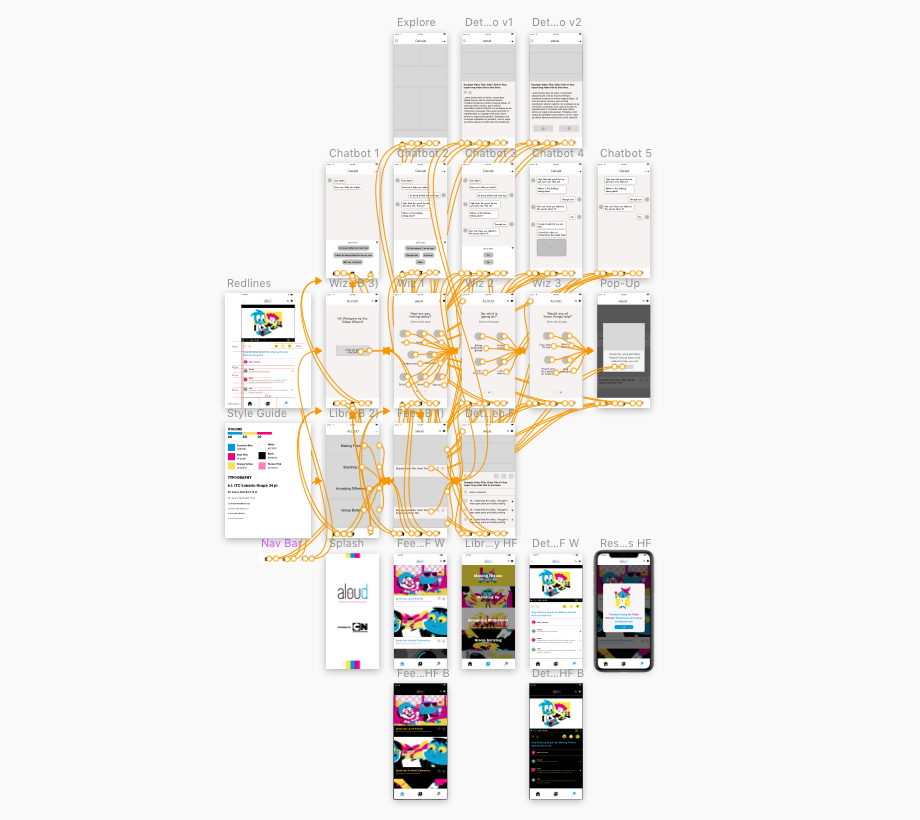

When wireframing and designing high-fidelity screens, creative decisions were made with the target user group of 8 to 11 year olds heavily in mind. Considering minimizing the amount of different types of information and maximizing calls to action that would ideally retain attention was a necessary step in the design process; in other words, increasing overall contrast, using larger font sizes, and limiting the amount of total text. This also included simplifying the home navigation bar at the bottom of the screen to just three tabs for key features.
05 USABILITY TESTS
For usability tests, the main objective was to have the user navigate through the complete version of the app and accomplish a given user task. The users were then asked to fill out a SUS (system usability scale) form for feedback. The usability tests were completed on a group of 38 grade school students ranging in age from 11 to 17. The average score for the usability tests was a passing rating of 93.48. The portion of the usability tests with the lowest rating being the need to “learn a lot of things before I could get going” with the application. The highest scoring portions were the application’s ease of use and the integration of system tools within the application.
A link to the SUS form can be found here.
06 next

redlines
Moving forward with the development of this app would ideally involve usability tests and input from actual test classrooms. The app could be implemented into class activities for a few months or even a year. Research could then be completed on how it affected things like reported incidents of bullying during that time frame.